
Preserving the Past, Designing for the Future
Transforming Digital Engagement for the National Trust for Scotland
Client
The National Trust for Scotland
My role
Digital Media Producer
Output
Website
Deliverables
Research, User testing, UX, UI
In partnership with the National Trust for Scotland, we delivered a fast, accessible, and emotionally resonant end-to-end service experience that reflects the Trust’s mission to protect Scotland’s heritage for future generations.
Across two phases, we restructured the site architecture, improved user journeys, and redesigned the underlying membership and donation services: digitising previously manual processes and creating scalable, connected experiences across Visit, Join, and Donate. This drove engagement, increased conversions, and better connected the Trust’s digital experience with its operational delivery.
The Problem
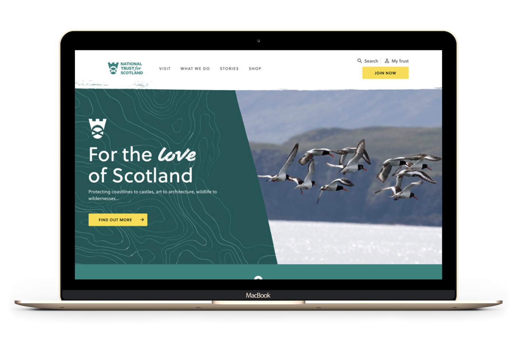
A fragmented experience for a modern audience
The Trust’s digital presence was struggling to meet the needs of a younger, more digitally focused audience. Years of organic growth had resulted in inconsistent property information and a network of disconnected microsites, with individual places effectively operating in isolation rather than as part of a unified charity service.
This fragmentation also extended beyond the front-end experience. Key user journeys, particularly joining and donating, relied heavily on manual processes and disconnected systems, creating inefficiencies for internal teams and friction for users. It was difficult for people to understand the full scope of the Trust’s work, its charitable impact, and how they could meaningfully engage or contribute.
The existing experience was:
Slow and difficult to navigate
Fragmented across microsites and outdated structures
Burdened by technical debt that limited performance, scalability, and future development
Inconsistent in content quality, tone, and depth across different places
Visually disjointed, lacking a cohesive design system
Aged in look and feel, reducing appeal to younger audiences
Unclear in communicating the Trust’s role and impact as a charity
Lacking clarity in how users could engage
Dependent on manual workflows for membership and donation management, limiting efficiency and scalability
In Phase 2, the challenge evolved:
The Trust wanted to drive deeper engagement across Visit, Join, and Donate (VMD), while also improving the efficiency and sustainability of the underlying services that supported these journeys.
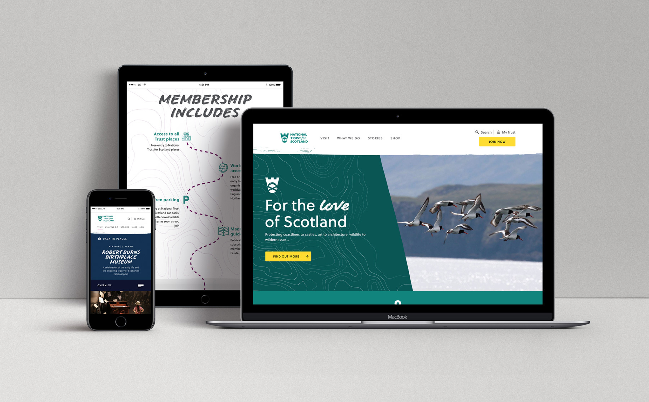
The solution
A unified, user-first platform with purpose-driven journeys
We delivered a fast, responsive site and service that:
Showcases the Trust’s broad and vital work
Supports seamless content management and CRM integration
Digitises membership and donation services, reducing reliance on manual processing and improving operational efficiency
Introduces fully integrated digital membership journeys, giving users self-service access to join, manage, and engage with their membership
Creates clear, intuitive pathways for users to explore, join, and contribute across channels
In Phase 2, we enhanced the VMD services with:
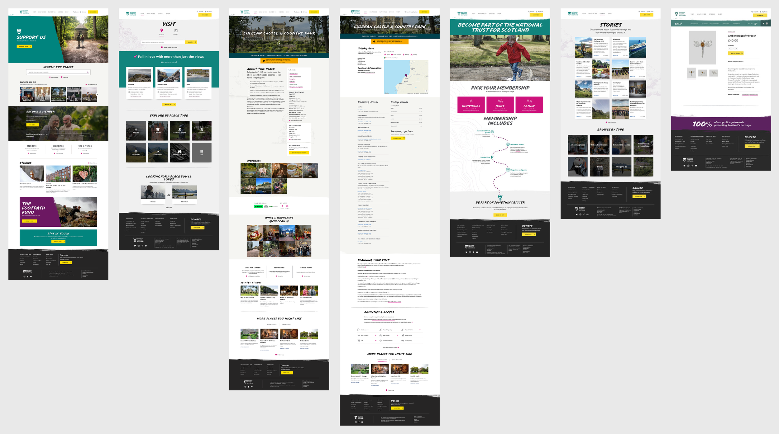
Rich editorial-style content to promote activities and appeals
Optimised end-to-end membership and donation journeys, improving both user experience and backend efficiency
SEO-optimised templates to drive traffic and improve discoverability
More connected service touchpoints, aligning digital interactions with on-site and organisational processes
Impact and results
The transformation delivered a connected, end-to-end experience that aligned the Trust’s digital presence with its real-world places, enabling the organisation to operate as a single, joined-up charity.
Created a seamless journey from digital discovery to real-world engagement, helping users move effortlessly from learning about the Trust’s work to visiting places, becoming members, or supporting through donations.
Unified previously disconnected digital touchpoints into a single platform, reducing fragmentation and ensuring a consistent experience across properties, campaigns and content.
Enabled the Trust to view user behaviour, interactions, membership and donation data in one place, providing a clear, organisation-wide understanding of how audiences engage across sites, campaigns and locations.
Introduced centrally managed digital membership and donation journeys, allowing member and donor relationships to be understood and nurtured across multiple places rather than in isolation.
Strengthened the Trust’s ability to run coordinated campaigns, measure impact, and make data-informed decisions, while still supporting the individuality of each place.
Repositioned the Trust as a modern, accessible charity, better equipped to engage younger audiences and build long-term relationships beyond a single visit.
Phase 2 Outcomes:
Visit: “Things to do” pages created rich, editorial-style content, driving 170,000+ users in 10 months.
Join: Streamlined membership flows and FAQs reduced user confusion by 48%.
Donate: New appeal templates and donation pathways increased donations by 14%, to the Trust’s four core themes.
A modern platform for a modern mission
31.7%
increase in users
33.3%
increase in sessions
10.7%
reduction in bounce rate
THE PROCESS
Discovery and research
Phase 1
Audited a complex, bloated, inconsistent information architecture and microsite network.
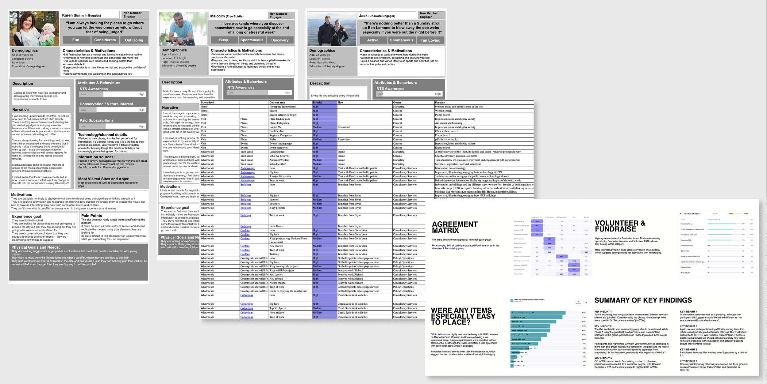
Conducted multiple rounds of user testing including card sorting and tree testing.
Developed and validated user personas to understand how different audiences engaged with the charity, identifying which messages and areas of its wide-ranging work resonated most with each group.
Collaborated with teams across the Trust’s many sites to capture local nuance and operational needs, ensuring each place’s uniqueness was reflected within a unified digital framework.
Planned CRM-integrated membership and donation journeys, defining data, flows and touchpoints required to digitise join and donate experiences at scale.
Mapped user flows and identified optimal content placement and presentation.
Phase 2
Analysed site data to identify bounce rates, session durations, and interaction drop-offs.
Ran stakeholder workshops to gather business needs and pain points.
Conducted user interviews to validate issues and prioritise improvements.
Created an effort vs. ROI matrix to guide development priorities.
Users did not experience the Trust as a single charity, but as a collection of disconnected places. While individual properties were appealing, the lack of consistency, clear charitable messaging and joined-up journeys made it difficult for users to understand the Trust’s wider purpose, build an ongoing relationship, or see how their visit, membership or donation contributed to something bigger.
As a result, users were more likely to engage with the Trust as a one-off experience, a single visit or attraction, rather than as an organisation they could support, return to, or belong to over time.
Design and prototyping
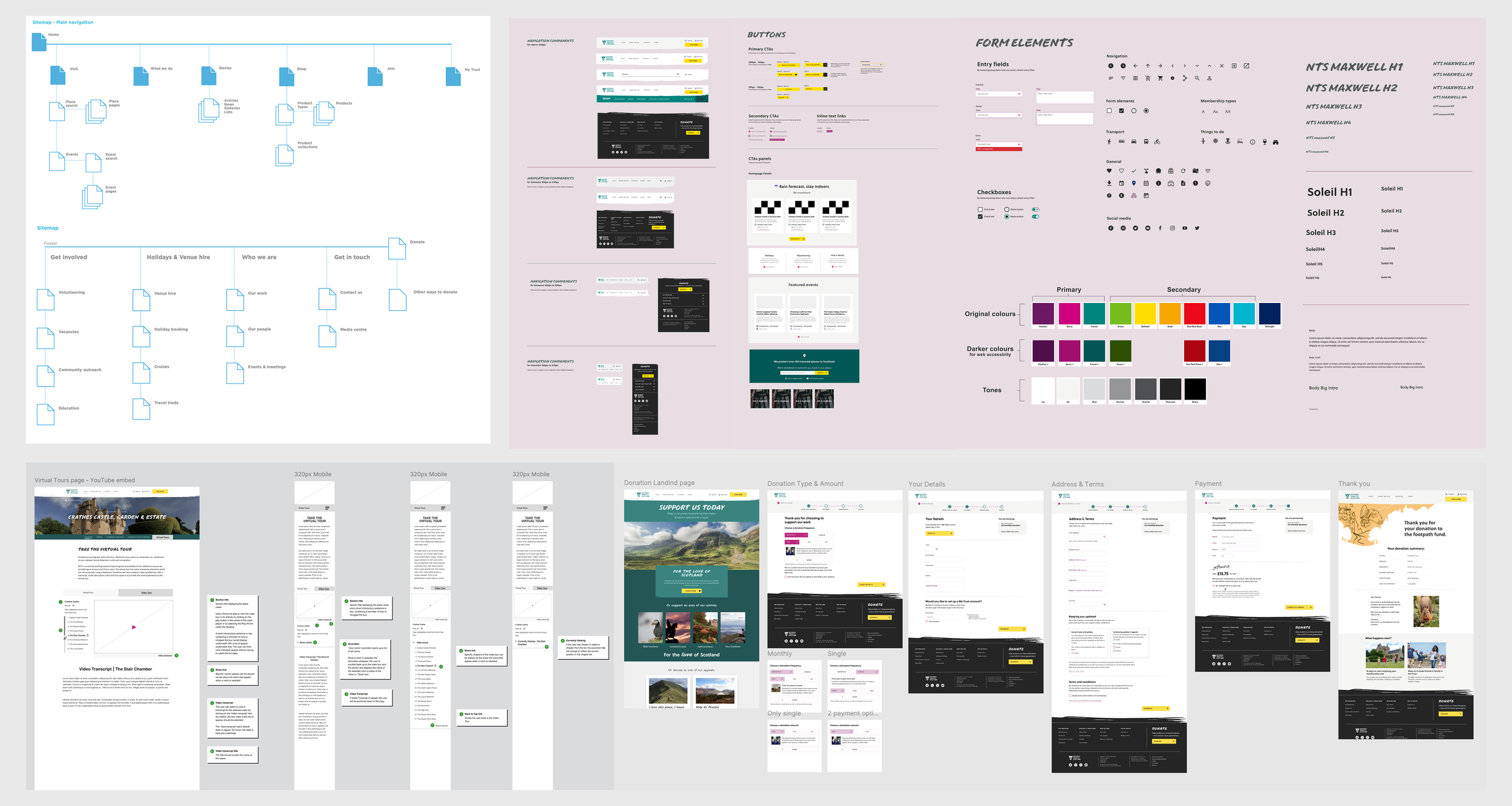
Information Architecture
Rebuilt the site structure to reflect user needs and expectations.
Visualised new navigation and content flows to support VMD journeys.
Wireframes & UI Design
Sprint-based design process with weekly client meetings and workshops.
Created high-fidelity prototypes for real-user testing.
Scoped all wireframes functionally to ensure clarity across teams.
User Testing
Conducted qualitative and quantitative testing across multiple regions.
Focused on wayfinding, content comprehension, and task success.
Used testing insights to validate improvements and gain stakeholder buy-in.
Accessibility & Performance
Built to WCAG 2.1 AA standards.
Tested with a variety of users with additional and complex needs.
Development and Delivery
Team Collaboration
Weekly stand-ups and cross-functional scoping ensured alignment.
Provided developers with detailed annotations and interaction specs.
Conducted design QA post-development to ensure fidelity and polish.
CMS & CRM Integration
Delivered a flexible CMS with author training for seamless content updates.
Integrated CRM to manage memberships and donor data efficiently.
Design System Foundations
Established scalable design patterns for future phases.
Ensured consistency across new templates and editorial content.
More projects
The Scottish Government
Scotland’s Migration Service
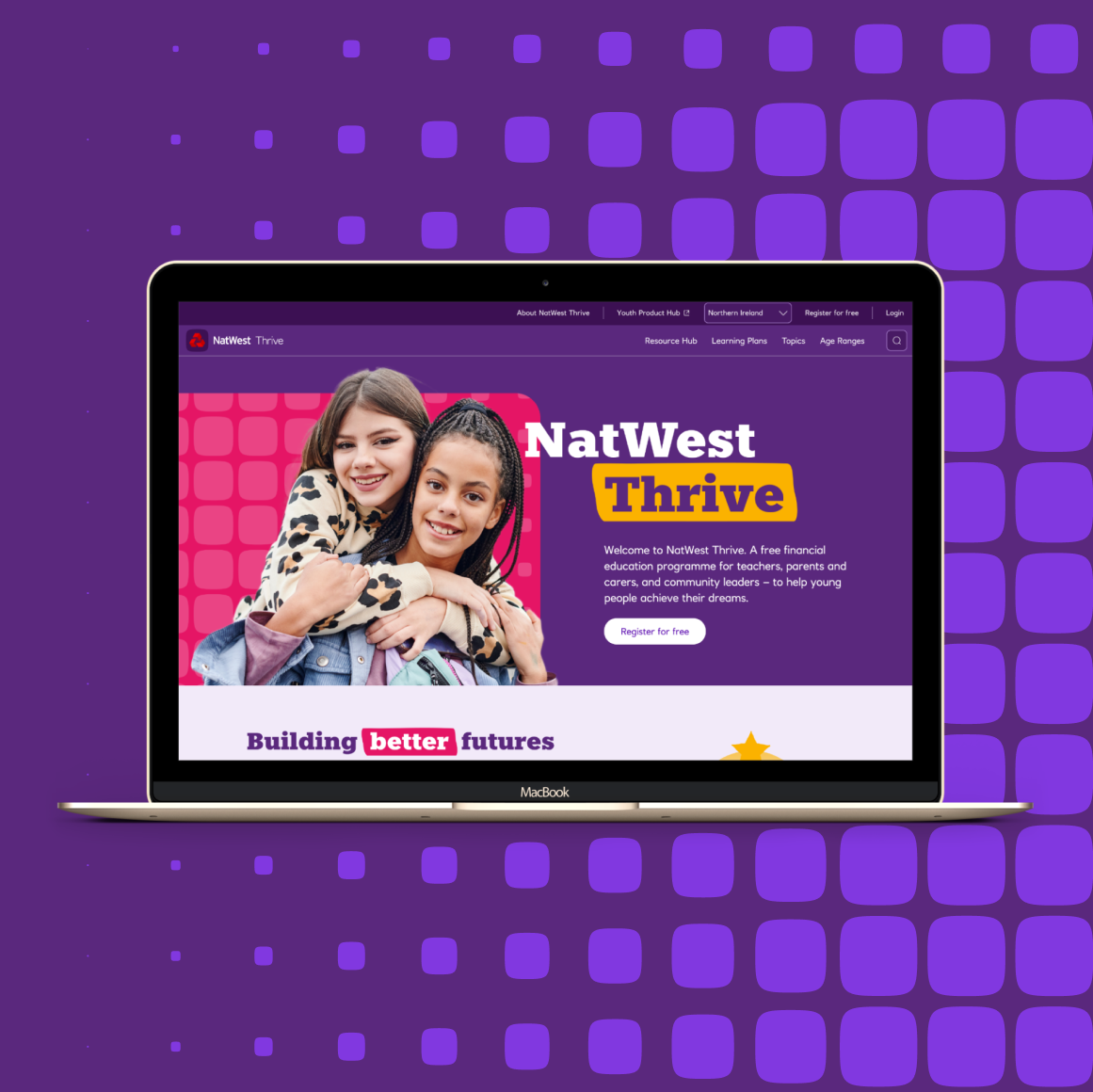
NatWest
NatWest Thrive
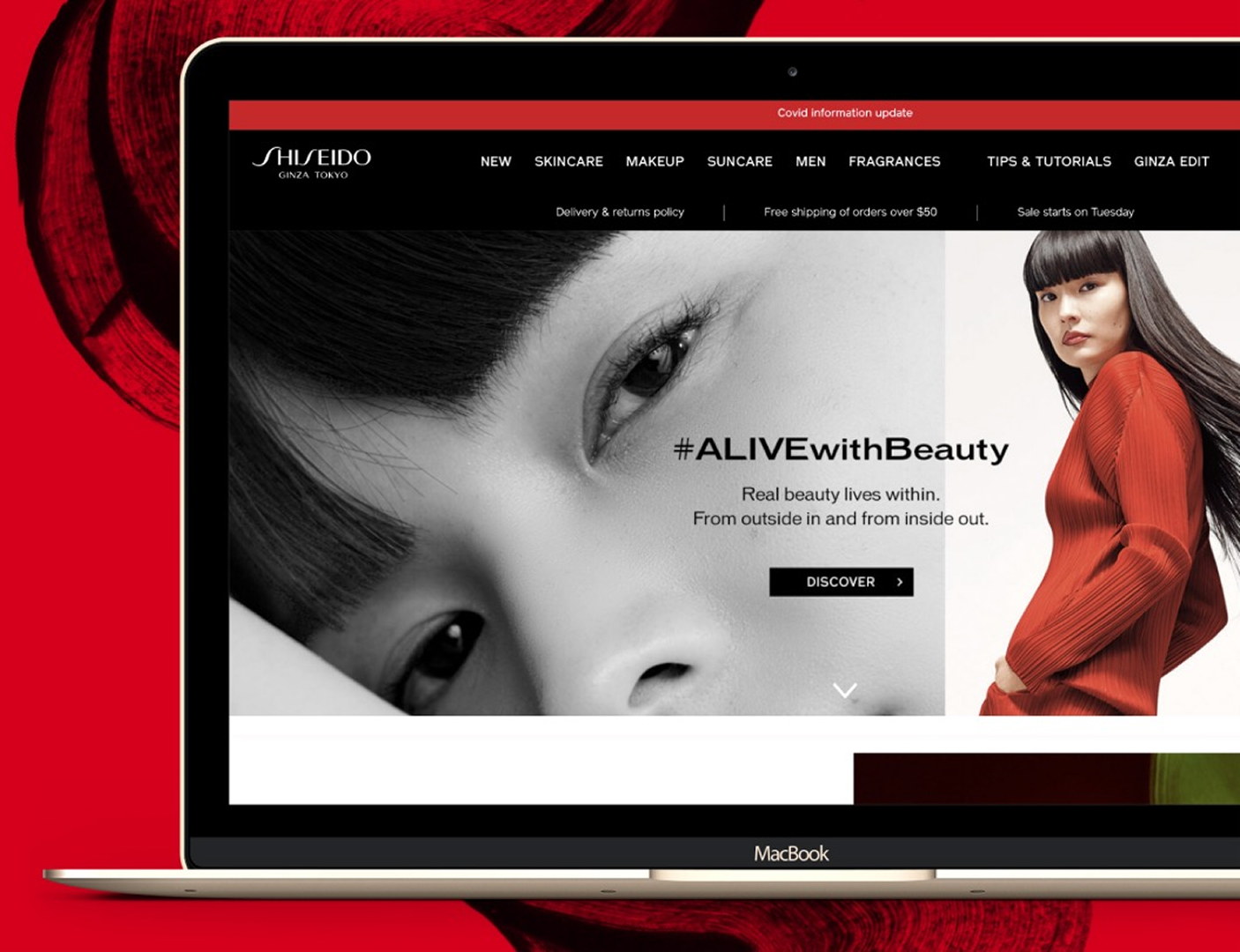
Shiseido
Global Master Website