
Designing Confidence
Unifying Shiseido’s Global Digital Experience
Client
Shiseido
My role
Senior Experience Designer
Output
Website, Digital design system
Deliverables
Research, UI, UX, Usability testing
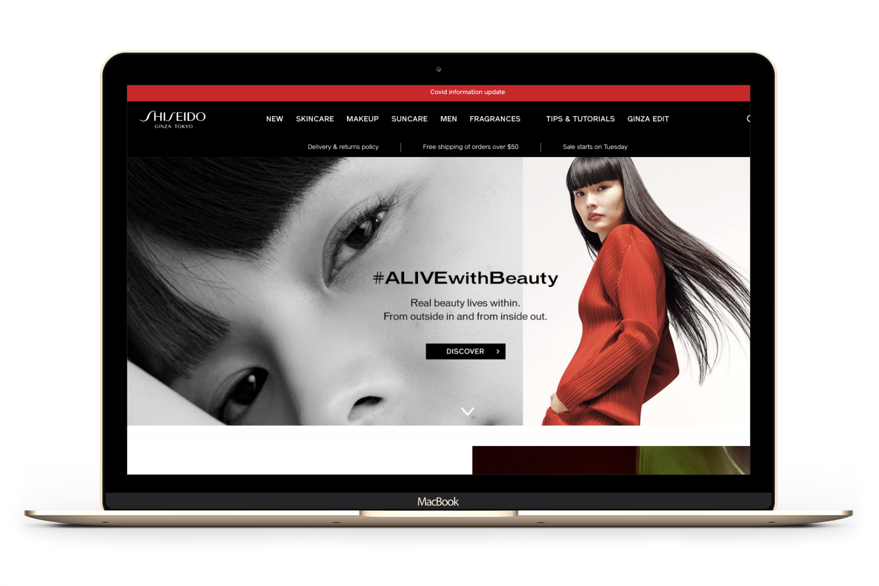
In partnership with Shiseido, we reimagined their global master site: transforming a fragmented, product-led experience into a unified, user-first platform that inspires confidence, drives conversion, and reflects the prestige of the brand across 39 markets. Through a scalable design system, intuitive navigation, and culturally adaptable design, we delivered a digital experience that educates, empowers, and connects users to the brand in meaningful ways.
The Problem

A disconnected experience across regions and user journeys
Shiseido’s global site was visually elegant but functionally inconsistent. Users struggled to:
Discover relevant products due to ambiguous navigation and poor search.
Understand their skincare needs or compare products effectively.
Navigate a dated UI with limited accessibility and mobile optimisation.
Engage with content that felt disconnected from their personal routines or cultural context.
Shiseido needed a solution that would:
Engage, educate, and inspire confidence in skincare and makeup selection.
Be adoptable across regional markets, supporting 12+ languages including German, Chinese, and Thai.
Deliver a prestigious, consistent brand experience while accommodating cultural and demographic nuances.
Align with a broader digital transformation strategy to unify global platforms and reduce operational inefficiencies.
The solution
A unified, user-led digital ecosystem
We created a best-in-class design system and restructured the site to:
Prioritise user concerns, product categories, and skin types: giving users three intuitive paths to discovery.
Introduce tips, tutorials, and editorial content to foster community and repeat visits.
Support flexible navigation slots for seasonal campaigns and regional business goals.
Deliver a dedicated design system site via Zeroheight, giving global teams a single source of truth.
Built on Salesforce Commerce Cloud, we worked within platform constraints to deliver:
A modular design system that improved operational efficiency by 40%.
Enhanced authoring experience for content teams.
A consistent, high-performing experience across 39 markets and 12+ languages.
Impact and results
A prestige experience, globally unified
The redesigned Shiseido master site delivers:
A consistent brand presence across all markets.
A user-first experience that builds confidence and drives conversion.
A scalable design system that empowers regional teams.
Strategic Impact
The design system became the foundation for all future Shiseido digital initiatives.
Reduced design and development time by 30% across regions.
Improved governance and brand consistency across global platforms.
Ongoing Optimisation:
A dedicated UX dashboard tracks key interactions and KPIs.
Monthly and annual reviews combine analytics with regional feedback.
Post-launch insights fed directly into future sprints, ensuring continuous improvement.
88%
Increase in revenue
78%
Average increase in global conversion rate
12
Regions adopted the design system
39
Markets successfully launched in first year and a half
THE PROCESS
Discovery and research
We began with a comprehensive analysis of the existing site, user behaviour, and stakeholder needs.
Key Activities:
Site audits and competitive benchmarking.
Google Analytics and SessionCam analysis of 100 days of user sessions.
Regional stakeholder surveys and global workshops to align on goals.
Baymard Institute training to embed best-in-class e-commerce UX principles.
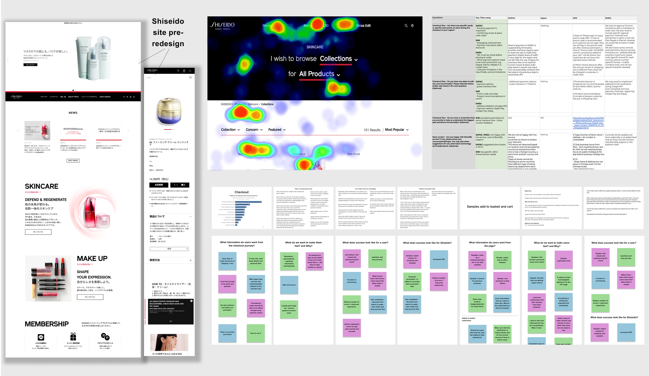
Users lacked confidence in product selection due to poor navigation, limited education, and unclear product information.
A more intuitive, informative experience was essential for user success.

Design and prototyping
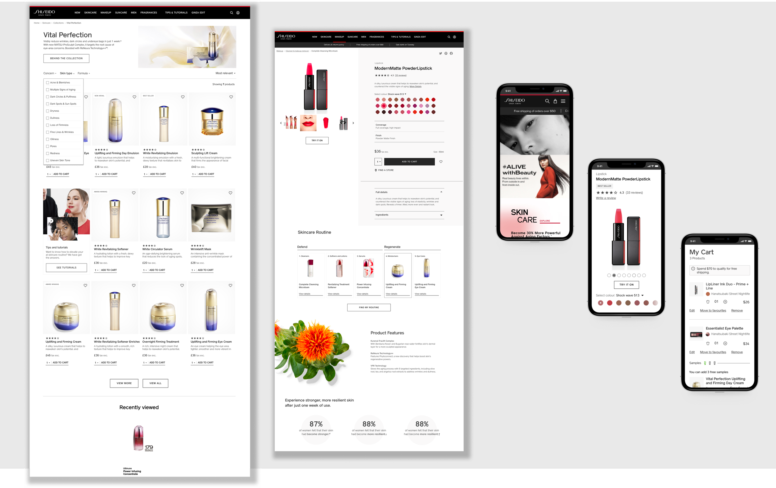
We restructured the site’s Information Architecture to reflect how users actually shop: by concern, skin type, or product category.
Fortnightly design sprints were supported by a detailed pre-design planning phase to align stakeholders on scope, dependencies, and expected outputs for each sprint. We then ran collaborative workshops with client and development teams across Japan, Bulgaria, and India, using rapid prototyping and live feedback loops to iterate quickly.
Navigation & Sitemap
Exposed products at the top level for faster decision-making.
Replaced ambiguous naming conventions with clear, user-friendly labels.
Added flexible slots for seasonal and regional content.
Editorial & Community Features
Introduced Ginza Edit, tips, and tutorials to promote learning and cross-promotion.
Created SEO-rich content hubs to drive traffic and encourage repeat visits.
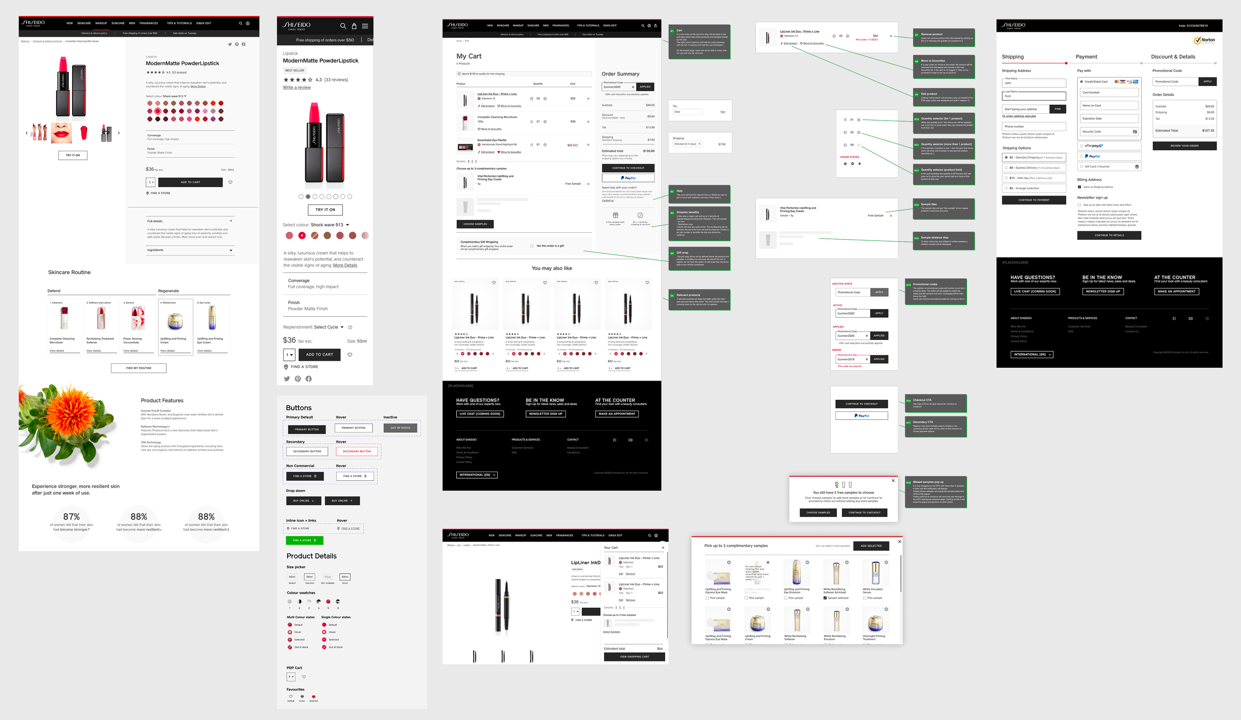
Search and Product listing pages
Autocomplete, suggested terms, in search product categorisation and full-screen search takeover.
SEO-rich headers and in-grid promotional tiles.
Enhanced filtering and sorting for personalised browsing.
UI improvements to define product tile, improving product visibility and ease of scanning for information consumption.
Option to view product list in large or small grids for in-depth comparison or top level details.
Clear error and tagging on product tiles to inform users of status and availability.
Content flexibility in tile to allow for regional and language variants on product content.
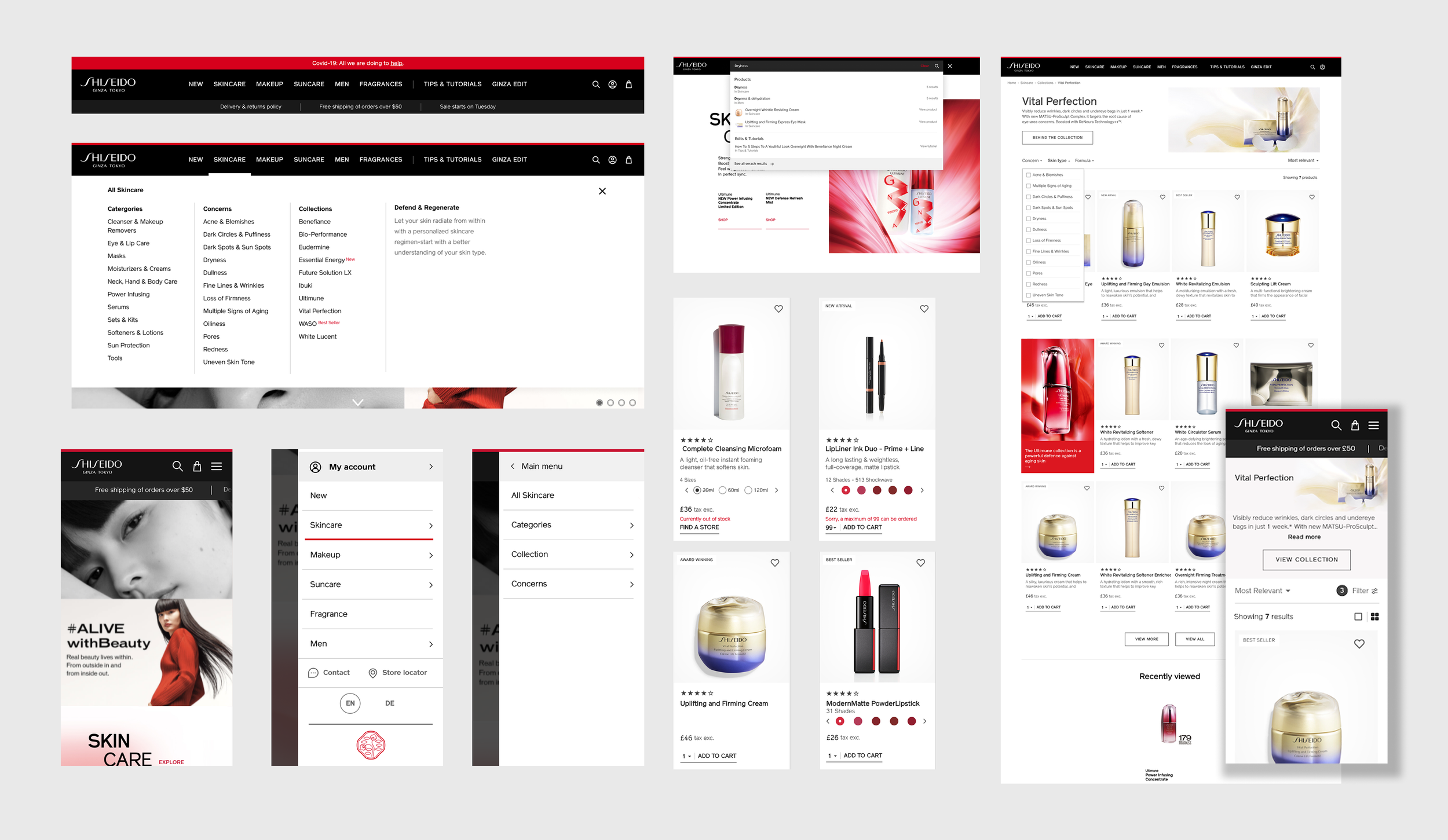
Product Details Pages
Clean, structured layout with hero imagery and videos.
Key product info pulled out for easy comparison.
User reviews added to build trust.
Wishlist, save-for-later, and back-in-stock alerts.
AR try-on and skin tone swatches for makeup.
Auto-replenishment options for repeat purchases.
Regimen-building and “complete the look” suggestions.
Product features and statistics to educate and inform.
Checkout Experience
Free samples per purchase to expose more products to users and reward loyalty.
Addition of a mini cart in journey to instantly update users of products added to cart, samples available and allow for cart edits without leaving user journey.
Improved UI to provide clarity between items and samples and editing cart contents.
Upfront total cart costs to ensure confidence in decision making.
In cart notifications to inform users of delivery times, product deals and clarity around basket updates.
One-page checkout with address lookup, payment options, and shipping transparency.
Option to save cart for purchase at a later date.
Inline error messaging and keyboard navigation for accessibility.
Optional post-purchase account creation to support guest checkout without forcing account creation up front.
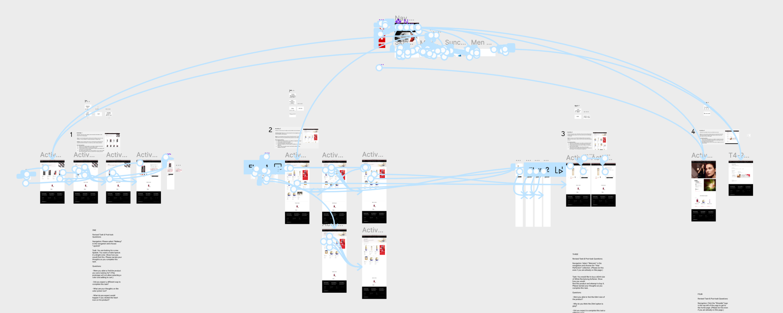
Usability testing
At the end of each design sprint high fidelity prototypes were made in Figma and user testing was carried out with users across multiple regions.
Testing consisted of qualitative scenario based tasks, impression testing and quantitive interviews depending on what functionality the sprint was focusing on.
Testing was not only essential to gain insights from users to improve the design and overall experience, but it was a hugely successful way to showcase the success of proposed improvements to the regional teams. The testing documentation and analysis was presented to regions allowing them to see first hand how successful the proposed improvements were and beneficial each release would be to customer experience and conversion.
12
Countries involved in usability testing
160

Users involved in testing rounds
89.3%
Average user satisfaction score during testing
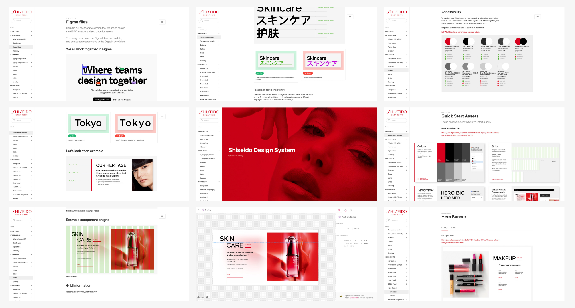
Digital design system
We created a dedicated Zeroheight site synced with our UI library, giving global teams instant access to Figma files, design assets, patterns, and documentation. The site provides clear guidance on where and how to use components and functionality, as well as how to add effective content. This replaced outdated PDFs with a dynamic, easy-to-use resource and enables regions to adopt, contribute to, and share approved work.
more projects
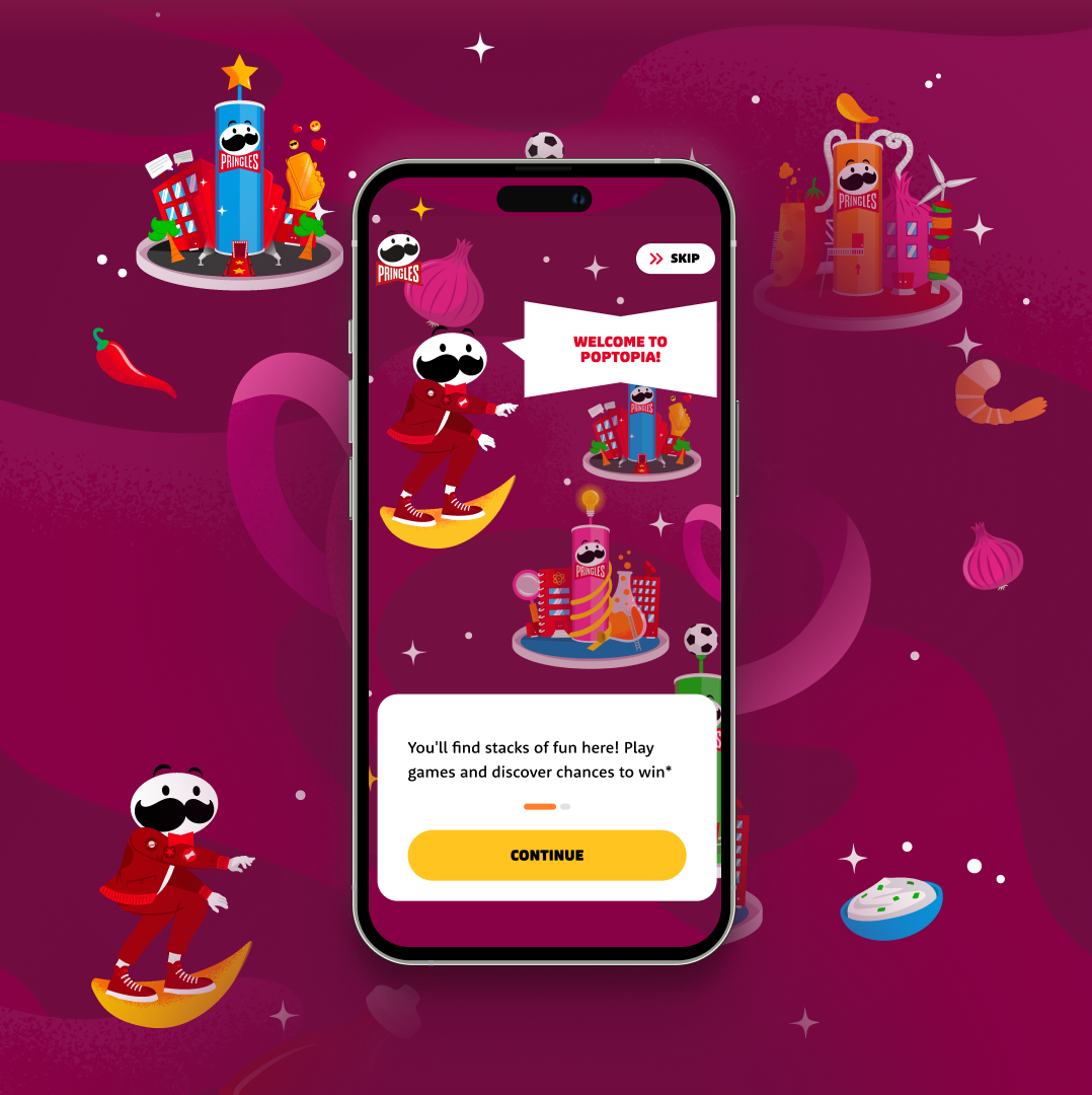
Kellonova - Pringles
Poptopia
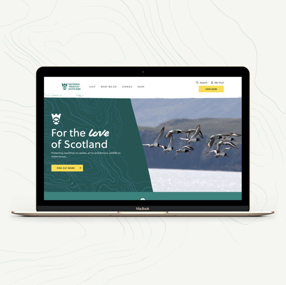
The National Trust for Scotland
Digital transformation
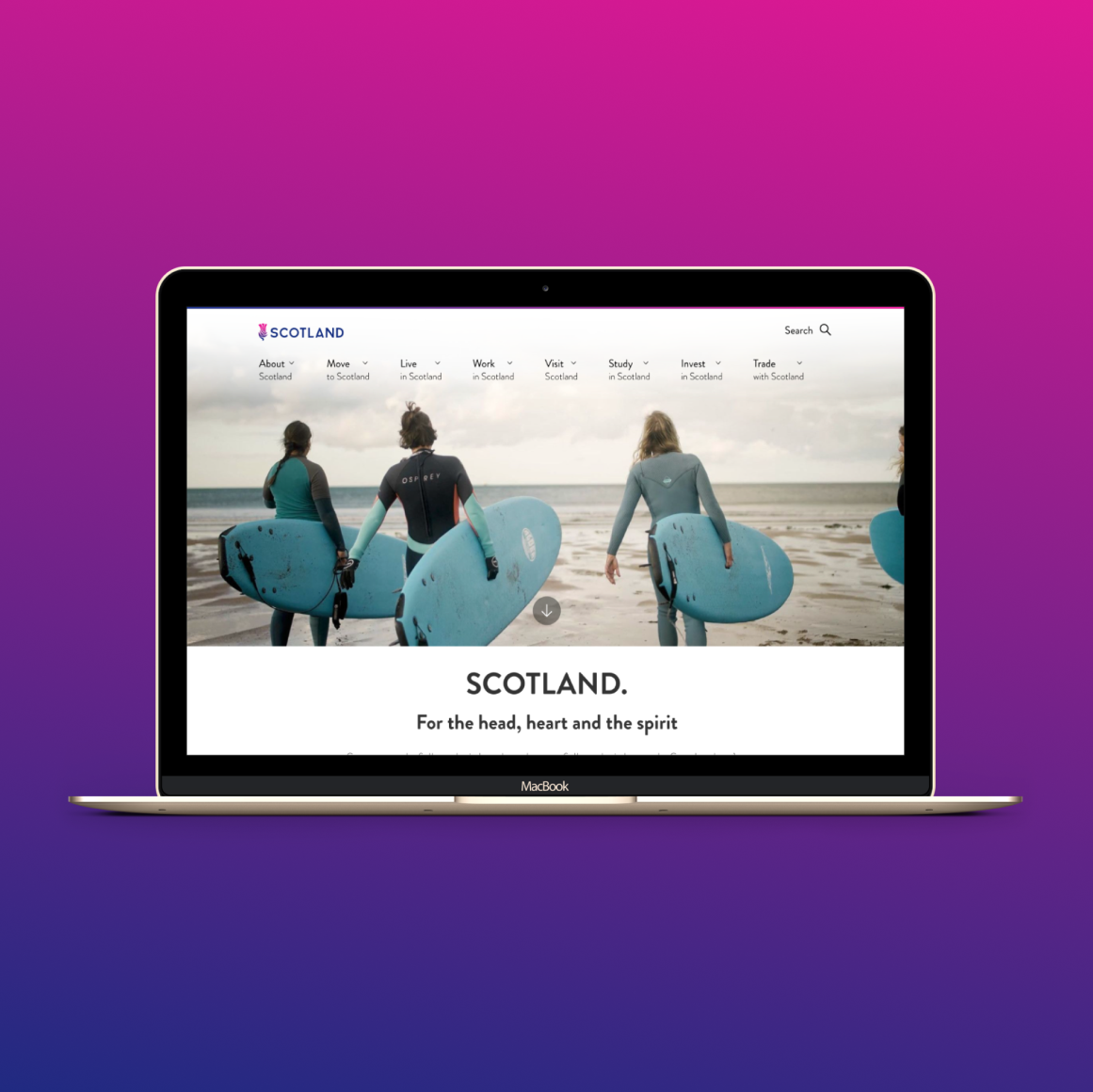
The Scottish Government
Scotland’s Migration Service